Ministry of eduction
Enhancing digital experiences for education in New Zealand, our work with the Ministry of Education focused on strategic design, accessibility, and system-wide UX improvements. This case study showcases our approach to creating a scalable, user-centred solution that integrates seamlessly with existing frameworks, delivering lasting impact.
Case Study
Ministry of Education, New Zealand - Pokapu Waka Kura
1. Project Overview
Client: Ministry of Education, New Zealand (Pōkapu Waka Kura)
Industry: Government / Education
Project Type: Website UX/UI Redesign & Custom UI Library
Timeline: 4 Weeks
Tools Used: Salesforce Design System, Figma, User Research Methods
Deliverables: UX Research, Customer Experience Enhancement, MVP, UI Library
Project Summary
Synthesise partnered with the Ministry of Education in New Zealand to enhance the customer and user experience of their "Pokapu Waka Kura" platform. Our primary goal was to improve school transport website usability while designing a custom UI library that seamlessly integrated with the Salesforce Lightning Design System. The project aimed to create a long-term UX foundation that would support future design system updates within the ministry.
2. The Challenge
The Ministry of Education needed a scalable and user-friendly digital experience for their platform, which serves a wide range of users, including educators, students, and government officials.
Key Challenges
Lack of a cohesive UI framework aligned with Salesforce standards.
Fragmented user journeys across different touchpoints.
Inconsistent UX patterns, making navigation difficult.
Time constraints requiring a Minimum Viable Product (MVP) within 4 weeks.
3. Research & Discovery
To address these challenges, our team conducted:
Stakeholder Workshops: Gathering insights from ministry departments and UX teams.
User Journey Mapping: Identifying pain points in existing navigation.
Salesforce Integration Research: Ensuring UI components complied with their design system.
Comparative UX Analysis: Benchmarking against similar government education portals.
Key Insights
Users struggled to find critical resources quickly.
The website lacked accessible navigation and search functionality.
UX teams within the ministry needed a scalable design system for future projects.
4. Design Approach
Our design methodology followed a human-centred approach, ensuring the new UI and UX enhancements were:
Consistent with the Salesforce Design System for future adaptability.
Simplified for users, reducing cognitive load.
Scalable to support long-term UI evolution within the ministry.
Key Deliverables
Custom UI Library: Tailored to meet the needs of different user groups.
Consolidated User Journeys: Streamlining navigation for educators and government users.
MVP Deployment: A functional product within 4 weeks, setting the groundwork for ongoing iterations.
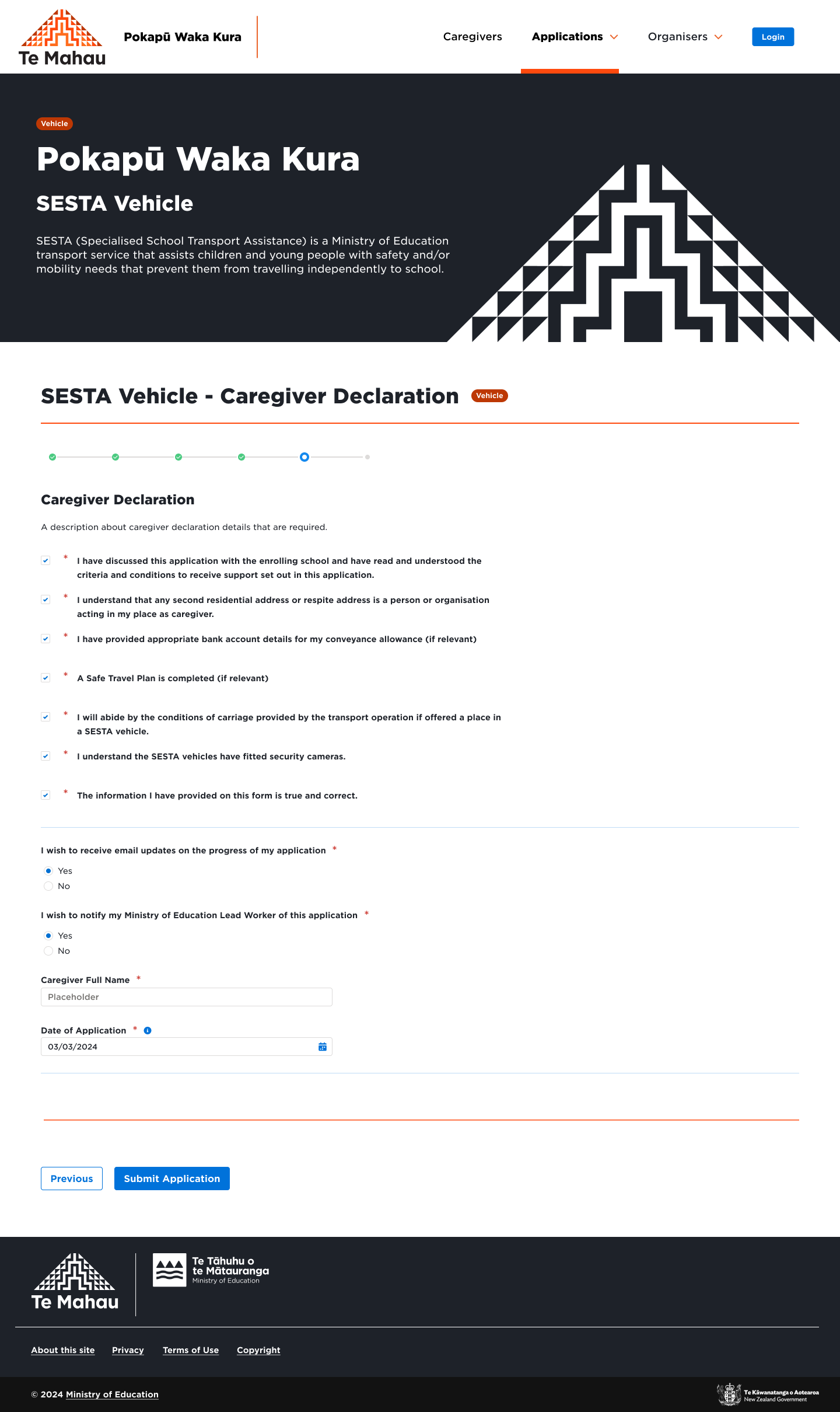
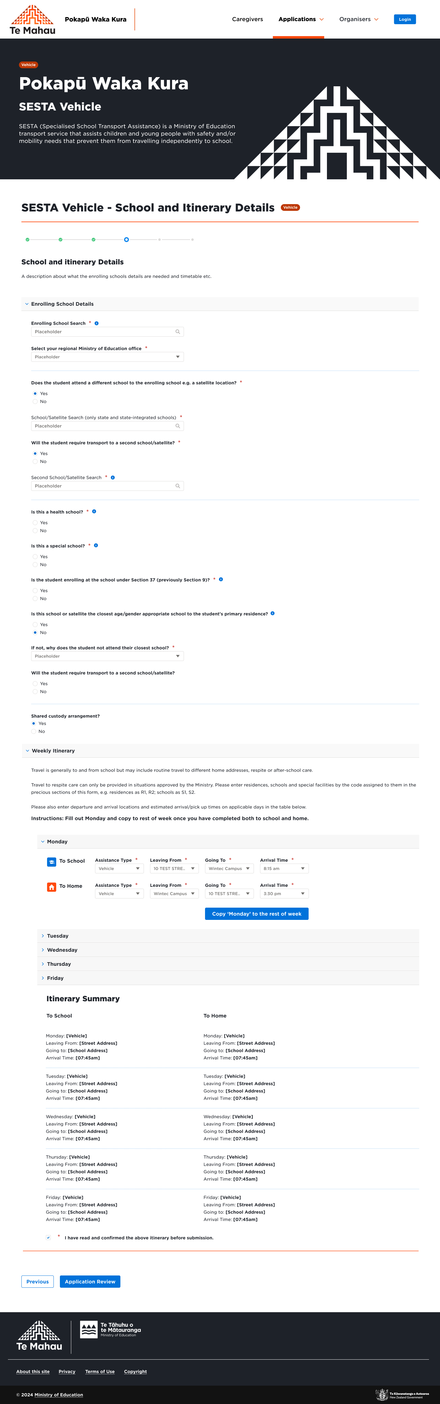
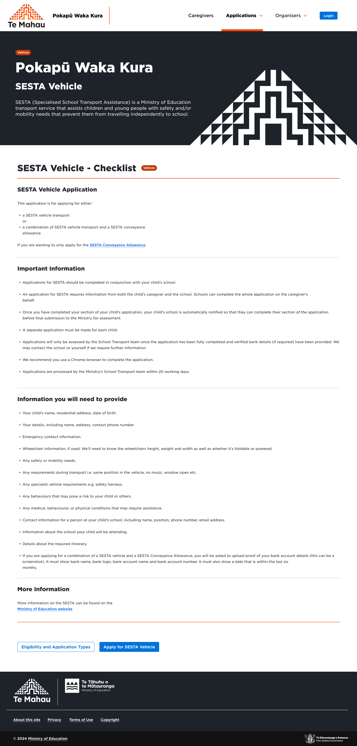
5. The Solution
Before
Disjointed navigation and user flow.
No unified design system, leading to inconsistencies.
Poor adoption by internal UX teams due to complexity.
After
Intuitive, user-friendly interface built for accessibility.
Modular UI components aligned with Salesforce guidelines.
Standardised UX framework for ongoing departmental improvements.
MVP delivered in 4 weeks, enabling immediate testing and adoption.
6. Results & Impact
30% Faster Content Discovery
Increased UX Efficiency: A scalable UI system now supporting multiple teams.
Reduced Redesign Costs: The ministry saved time and resources by leveraging the custom UI framework.
Long-Term Adoption: The new design system set a precedent for future government digital projects.
7. Lessons Learned & Next Steps
Lessons Learned
Iterative Design is Key: Continuous feedback loops helped refine the UX framework.
Collaboration with Internal UX Teams is Crucial: Ensuring a smooth handover of design systems for future scalability.
Salesforce Integration Requires Strategic Planning: Understanding component constraints early streamlined implementation.
Next Steps
UX Training for Ministry Teams: Ensuring smooth adoption of the new system.
Further Accessibility Enhancements: Expanding WCAG compliance to optimise inclusivity.
Ongoing UI Evolution: Regular updates to meet new policy requirements.
Conclusion
This project successfully improved the user experience and accessibility of the Pokapu Waka Kura platform while ensuring long-term sustainability through a structured design system. By integrating with Salesforce and creating a scalable UI framework, Synthesise provided a foundation that will continue to support the Ministry of Education’s digital transformation efforts. The collaboration between UX teams and stakeholders allowed for a streamlined user journey, delivering immediate benefits while setting a precedent for future enhancements.